Flex Container Properties Default values in blue
The following properties affect the flexbox container. Click here to toggle all the property descriptions.
- :
-
To create a flexbox, set the
displayproperty on the parent container element toflexfor a block-level flex container orinline-flexfor an inline-level flex container. Both of these values define the element as a "flex container" and its children as "flex items". - :
-
The
flex-directionproperty specifies how flex items flow within a flex container by setting the container's main axis either horizontally (like rows) or vertically (like columns).- With the
flex-directionset torow, flex items are added from left to right - With the
flex-directionset torow-reverse, flex items start on the right and are added on the left. - With the
flex-directionset tocolumn, flex items are added from top to bottom - With the
flex-directionset tocolumn-reverse, flex items start on the bottom and are added on the top.
This property also defines the cross axis (which is perpendicular to the main axis) which is implemented when the
flex-wrapproperty is set towraporwrap-reverse. Note thatrowandrow-reverseare reversed if thedirectionproperty isrtl.In the flex container above, the
flex-directionis indicated by a blue arrow in the upper left corner. - With the
- :
-
By default, flex items are laid out in a single line (row or column). Setting the
flex-wrapproperty allows content to wrap onto multiple lines (rows or columns) while setting the direction of the cross axis in the process.If the
flex-directionis set toroworrow-reverseandflex-wrapis set towrap, flex items will wrap from top to bottom (wrap-reversewould make flex items wrap from bottom to top).If the
flex-directionis set tocolumnorcolumn-reverseandflex-wrapis set towrap, flex items will wrap from left to right (wrap-reversewould make flex items wrap from right to left).When the
flex-wrapproperty is set tonowrap, flex items will be added to fit the flex container and overflow the container if the flex items can't be shrunk to fit. Note that the wrapping of columns will be reversed if the direction property is rtl.In the flex container above, the cross axis is indicated by a green arrow in the upper right corner.
- :
- row nowrap
A shorthand property for the
flex-directionandflex-wrapproperties. - :
-
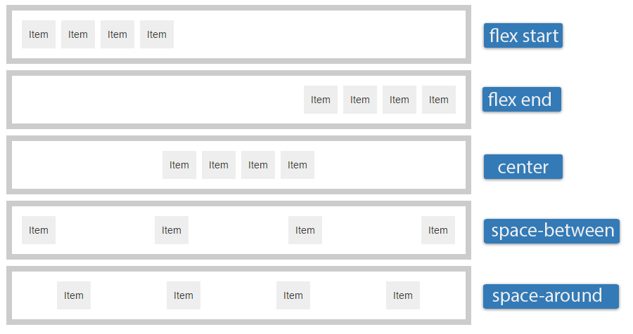
The
justify-contentproperty specifies how the browser distributes space between and around flex items along the main axis of their container.flex-start: Pack flex items at the start of the main axis (akin to left justified if the flex-direction was row)flex-end: Pack items at the end of the main axis (akin to right justified if the flex-direction was row)center: Pack items around the center (akin to centered)space-between: Distribute items evenly with the first item at the start and the last at the endspace-around: Distribute items evenly with equal space around each item
- :
-
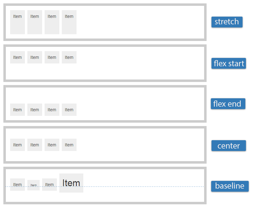
Similar to
justify-contentbut for the perpendicular cross axis direction.flex-start: Align to cross axis startflex-end: Align to cross axis endcenter: Center flex items along the cross axisbaseline: Align the flex items’ baselinesstretch: Stretch flex items to fit their container along the cross axis
- :
-
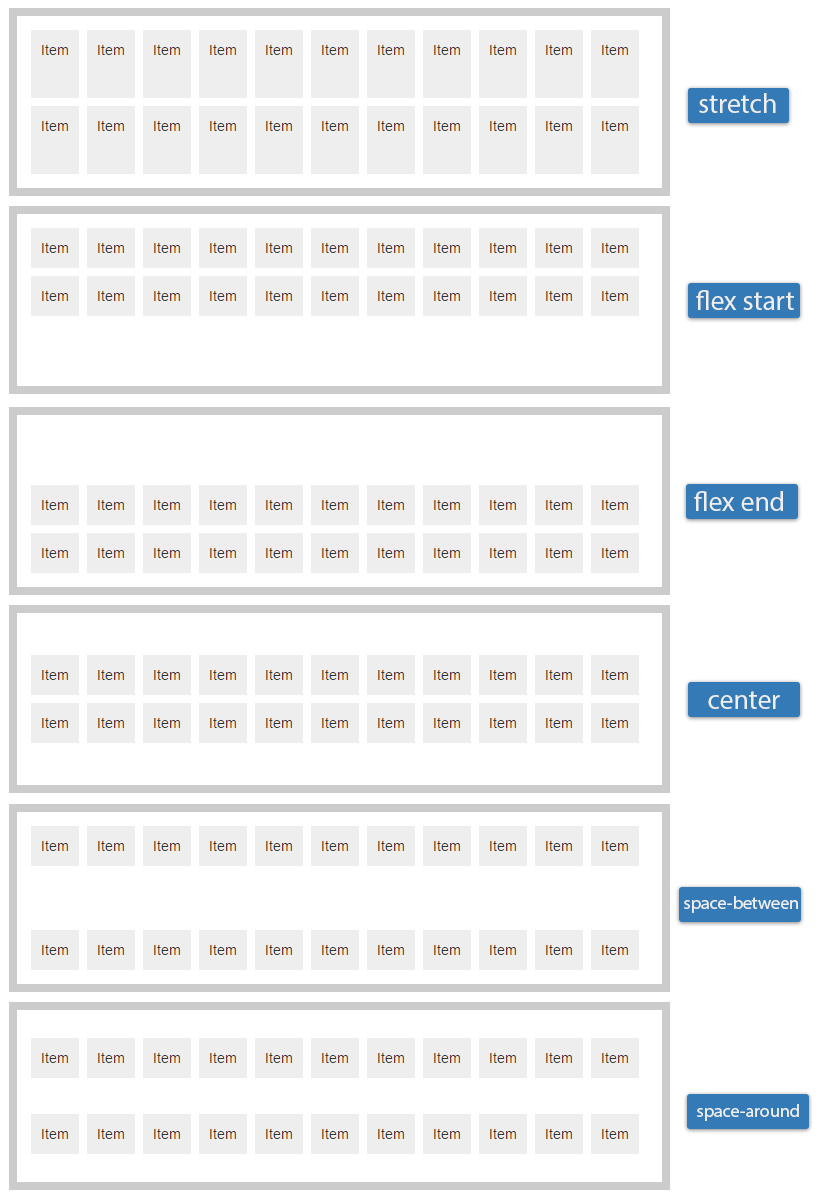
The
align-contentproperty aligns a flex container's lines along the cross axis when there is extra space, similar to howjustify-contentaligns individual items within the main axis. This property has no effect on single line flexible boxes.flex-start: Pack lines from the cross-axis startflex-end: Pack lines from the cross-axis endcenter: Pack lines around the cross-axis centerspace-between: Distribute lines along the cross-axis, start to endspace-around: Distribute lines along the cross-axis, equally spacedstretch: Stretch lines to occupy the whole cross-axis
Flex Item Properties Click an item in the flex container to modify it
The following properties affect flexbox items. Click here to toggle all the property descriptions.
- :
-
The
flex-growproperty specifies the "flex grow factor" of a flex item which determines how much the flex item will grow relative to the rest of the flex items in the flex container when positive free space is distributed (negative numbers are invalid). The initial value is0. - :
-
The
flex-shrinkproperty specifies the "flex shrink factor" of a flex item which determines how much the flex item will shrink relative to the rest of the flex items in the flex container when negative free space is distributed (negative numbers are invalid). Note: The flex shrink factor is multiplied by the flex base size when distributing negative space. This distributes negative space in proportion to how much the item is able to shrink, so that e.g. a small item won't shrink to zero before a larger item has been noticeably reduced. The initial value is1 - :
-
The
flex-basisproperty specifies the initial main size of a flex item. Defined as a number followed by an absolute unit such aspx,mmorpt, or a percentage of the parent flex container main size property. Negative values are invalid. It takes the same values as the width property. The initial value isauto - :
- Shorthand for the above three properties
A shorthand property for the
flex-grow,flex-shrinkandflex-basisproperties. It's recommended to use the shorthand over the individual properties as the shorthand correctly resets any unspecified components to accommodate common uses. The initial value is0 1 auto - :
-
Aligns flex items of the current flex line overriding the flex container's
align-itemsvalue. The initial value is auto.auto: Computes to parent's align-items value or stretch if the element has no parent.flex-start: The cross-start margin edge of the flex item is flushed with the cross-start edge of the line.flex-end: The cross-end margin edge of the flex item is flushed with the cross-end edge of the line.center: The flex item's margin box is centered within the line on the cross-axis. If the cross-size of the item is larger than the flex container, it will overflow equally in both directions.baseline:All flex items are aligned such that their baselines align. The item with the largest distance between its cross-start margin edge and its baseline is flushed with the cross-start edge of the line.stretch: Flex items are stretched such as the cross-size of the item's margin box is the same as the line while respecting width and height constraints.
- :
-
Controls the order in which children of a flex container appear inside the flex container. Flex items are, by default, displayed and laid out in the same order as they appear in the source document. A flex container lays out its content in order-modified document order, starting from the lowest numbered ordinal group and going up. Items with the same ordinal group are laid out in the order they appear in the source document. The inital value is
0and negative values are permitted. - :
- :
What is Flexbox?
Flexbox is a way to layout elements to accommodate different screen sizes. Flexbox does not rely on floats and margins, and the flex container's margins don't collapse with the margins of its contents. Note that some browsers need prefixes to use these features.
The "flex" in flexbox comes from its ability to alter its items' width, height, and order to best fill the available space. Flexible items expand and shrink to fill the available space.
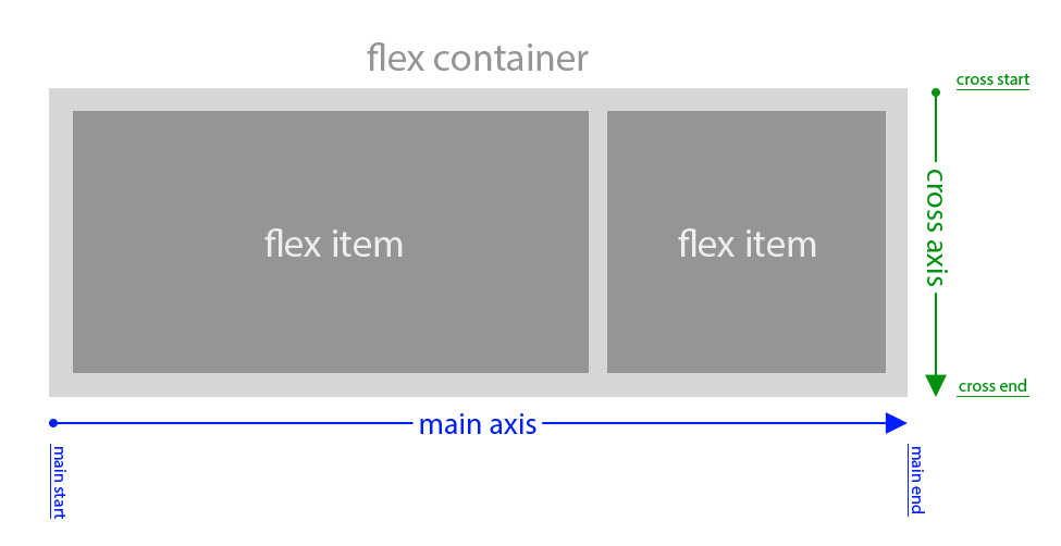
Flexbox content begins with a container whose display property is set to flex or inline-flex. Any elements within that container are now automatically flex-items. Every flexible box layout follows two axes. The main axis is the axis along which the flex items follow each other. The cross axis is the axis perpendicular to the main axis. For example, if we have the flex-direction set to row, the main axis is horizontal (left to right unless the direction is set rtl) and the cross direction is vertical (top to bottom)
What isn't Flexbox?
The answer to every layout problem. Like any tool, flexbox has its place in your toolbox, but it's not meant to be a cure-all for every layout issue.
What is this site?
This site is a resource where you can learn about flexbox and test out various basic flexbox layouts. The playground area allows you to manipulate the flex container and flex items quickly and easily without having to write any code. It's a work-in-progess that will be updated with examples and new information as standards evolve.
Glossary Frequently used flexbox-related terminology
- Axes
-
Every flexible box layout follows two axes. The main axis is the axis along which the flex items follow each other. The cross axis is the axis perpendicular to the main axis.
- The
flex-directionproperty establishes the main axis. - The
justify-contentproperty defines how flex items are laid out along the main axis on the current line. - The
align-itemsproperty defines the default for how flex items are laid out along the cross axis on the current line. - The
align-selfproperty defines how a single flex item is aligned on the cross axis, and overrides the default established byalign-items.
- The
- Cross axis
- The axis perpendicular to the main axis.
- Cross-start/cross-end
- Flex lines are filled with items and placed into the container starting on the cross-start side of the flex container and going toward the cross-end side.
- Dimensions
-
The flex items' agnostic equivalents of height and width are main size and cross size, which respectively follow the main axis and cross axis of the flex container.
- Directions
-
The main start/main end and cross start/cross end sides of the flex container describe the origin and terminus of the flow of flex items. They follow the main axis and cross axis of the flex container in the vector established by the writing-mode (left-to-right, right-to-left, etc.).
- Flex container
- The parent element in which flex items are contained. A flex
container is defined using the
flexorinline-flexvalues of the display property. - Flex item
-
Each child of a flex container becomes a flex item. Text directly contained in a flex container is wrapped in an anonymous flex item.
- Lines
-
Flex items can be laid out on either a single line or on several lines according to the flex-wrap property, which controls the direction of the cross axis and the direction in which new lines are stacked.
- Main axis
- The primary axis along which flex items are laid out.
- Main-start/main-end
- The flex items are placed within the container starting on the main-start side and going toward the main-end side